Case Study
01
Project
Community Centre

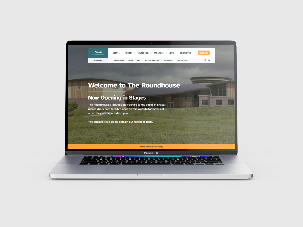
ClickSpace empowered The Roundhouse on their journey to build a website as inclusive and accessible as their community centre
Client Overview
The Roundhouse is a newly established community centre in the Isle of Man that is committed to promoting community, inclusivity and accessibility for all individuals within the island’s community. They offer a variety of facilities, events, and resources to individuals from all backgrounds, abilities, and ages.
Challenge
As The Roundhouse sought to start delivering their impact within the community, they recognised the crucial role a well-designed website would play in achieving their mission. However, they faced the challenge of creating a digital platform that truly reflected the values of inclusion and accessibility that The Roundhouse project has been built upon. ClickSpace, a leading web design agency known for its expertise in creating user-centric, inclusive and accessible websites, were more than happy to help them in this endeavor.
Solution
Understanding Values and Objectives
ClickSpace initiated the project by conducting in-depth discussions with The Roundhouse team to understand their values, mission, and objectives thoroughly. It was crucial to align the website design with The Roundhouse’s commitment to inclusivity and accessibility.
Adhering to WCAG Guidelines
From the outset, ClickSpace ensured that the website design adhered strictly to the Web Content Accessibility Guidelines (WCAG) 2.1 standards. This involved incorporating features such as alternative text for images, keyboard navigation support, and color contrast considerations to make the website accessible and enjoyable to use for individuals with various disabilities.
Careful Information Architecture
ClickSpace employed a user-centric approach to information architecture, organising content in a logical and intuitive manner. This ensured that visitors, regardless of their background or abilities, could easily navigate the website and find relevant information.
Detailed User Personas
ClickSpace developed detailed user personas representing different segments of The Roundhouse’s target audience, including teenagers, older adults, parents with young children, and culturally diverse groups. These personas helped in understanding the unique needs, preferences, and challenges of each user group, guiding the design process to accommodate diverse requirements effectively.
Accessible Design Elements
ClickSpace incorporated accessible design elements such as scalable fonts, clear typography, and intuitive navigation menus. They also utilised responsive design techniques to ensure that the website was optimised for various devices and screen sizes, further enhancing accessibility.
Interation and Testing
Throughout the development process, ClickSpace conducted extensive usability testing with individuals representing different user personas. This feedback-driven approach allowed them to identify and address any usability issues or accessibility barriers promptly, ensuring that the final website met the needs of all users effectively.
As with all ClickSpace projects, the website was meticulously tested to ensure compatibility across various browsers and devices prior to launch.
Results
Enhanced Accessibility
By adhering to WCAG guidelines and incorporating inclusive design principles, ClickSpace successfully created a website that was accessible to individuals of all abilities. Users with disabilities could navigate the website with ease, accessing information and resources without encountering barriers.
Optimised User Experience
The user-centric design approach and detailed user personas resulted in a significantly improved user experience for all visitors to The Roundhouse’s website. Whether they were seeking information about facilities, events, or one of the many businesses that are based in The Roundhouse, users could find what they needed quickly and efficiently.
Alignment with Values
The website design effectively reflected The Roundhouse’s values of inclusivity and accessibility, serving as a digital extension of their commitment to welcoming all individuals within the community. It helped reinforce The Roundhouse’s reputation as a welcoming and inclusive space for everyone.
High Engagement Levels
With an accessible and user-friendly website, The Roundhouse has experienced significant engagement from diverse cross-section of community members, and this trend looks set to continue as the venue opens their remaining on-site facilities throughout 2024.
Conclusion
Through a collaborative effort between ClickSpace and The Roundhouse, a new website was created that not only met the technical requirements for accessibility but also embodied the values of inclusivity and accessibility at the heart of The Roundhouse’s mission.
By prioritising the needs of diverse user groups and employing best practices in web design, ClickSpace empowered The Roundhouse to reach a broad audience and create a more inclusive community space both online and offline.
Link
Experience The Roundhouse’ website for yourself by visiting:


